
繁體中文的文字渲染,一直是開源 T2I 模型的痛點。
各家模型在 LongTextBench 上動輒 0.93 以上的高分,但那是簡體中文的成績。繁體中文呢?筆畫更多、結構更複雜的「濱」「廳」「醫」「膚」,這些模型真的寫得出來嗎?
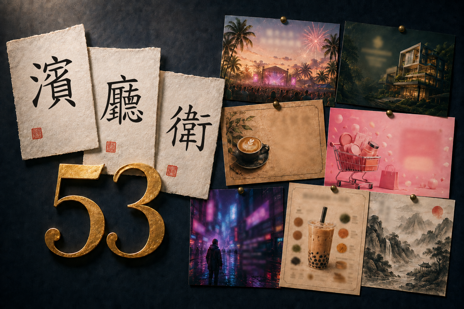
我用同一套 53 組 prompt,在 ComfyUI 上跑了五個當前最熱門的開源 T2I 模型,每組出 4 張挑最好的 1 張。以下是實測結果(本文附錄節錄其中 14 組 prompt;完整 53 組已獨立成題目全公開)。
本文是 2026 年 6 月的測試批次,結論以當時這五個模型為限,不代表全站最新排名。同一套題庫的後續測試:SenseNova U1.5 繁體中文實測(2026 年 9 月,首度把「濱」寫對)、SenseNova 官方 Prompt 增強實測(同 seed A/B,看 prompt 改寫能救多少);完整 53 組題目在題庫正本。
快速結論
- 五個開源 T2I 模型(ERNIE-Image Turbo、Qwen-Image-2512、Boogu Base、Z-Image、KREA 2 Turbo)測了 53 組 prompt,繁體中文文字渲染沒有一個能穩定過關
- 「濱」(17 畫)是全模型死亡字,20 張測試圖無一寫對;「廳」「衛」「蚵」「闊」「膚」同樣沒有模型能穩定渲染
- 大標題(4 字以內)推薦 ERNIE 或 Qwen,成功率最高;需要繁體中文長文,目前只能後製手動加字
- Z-Image 繁簡混淆最嚴重(LongTextBench 0.936,五模型最低),ERNIE Turbo 以 0.964 分文字渲染最穩
- 不需要中文字、追求純美感時 KREA 2 構圖想像力最強,但文字渲染是五模型中最差
參賽選手
| 模型 | 開發者 | 參數量 | LongTextBench (中文) | 設計哲學 |
|---|---|---|---|---|
| ERNIE-Image Turbo | 百度 | 8B | 0.964 | 文字渲染優先 |
| Qwen-Image-2512 | 阿里 | 20B | 0.965 | prompt 遵從 + 多語言 |
| Boogu Base | Boogu Project | 10B | 未公布 | 精準指令控制 |
| Z-Image | 阿里通義 | 6-7B | 0.936 | 速度 + 效率 |
| KREA 2 Turbo | KREA | 12.9B | — | 美學優先 |
測試條件
| 項目 | 本篇設定 |
|---|---|
| 測試日期 | 2026 年 6 月 |
| 題庫 | 繁體中文題庫 v1.0(17 類 53 組,題目正本) |
| 模型 | ERNIE-Image Turbo、Qwen-Image-2512、Boogu Base、Z-Image、KREA 2 Turbo(版本見上表) |
| 執行環境 | ComfyUI v0.20.3,本機推理 |
| 解析度 | 統一 1024×1024 |
| 生成與挑圖 | 每題出 4 張,挑最好的 1 張展示;結果反映的是「挑圖後可以達到的效果」,不是單張命中率 |
| 評分方式 | 文字正確性:引號內文字逐字人工核對,繁簡混淆另記;美感:作者主觀判斷,與文字分開評 |
| 本篇回答的問題 | 在允許挑圖的前提下,各模型的繁體中文字能做到什麼程度 |
先看好消息:它們做得到的事
在開始挑毛病之前,先展示成功案例。當文字量少、字體大、結構簡單時,這些模型確實能交出漂亮的成績。
浮世繪台北

短文字 + 藝術風格:「台北春景圖」四字,五模型均正確渲染
四個字的大標題,對所有模型來說都在舒適圈內。更值得注意的是風格差異 — 同一個 prompt,五個模型各自演繹出不同的浮世繪詮釋。
名片設計

大字 + 簡單結構:名片場景是繁體中文最安全的用法
大字號的人名、簡短的職稱,是目前繁體中文文字渲染最穩定的使用方式。如果你的設計只需要幾個大字,現階段的模型已經堪用。
壞消息來了:繁體中文的殘酷現實
「濱」— 全模型死亡字

「濱」字挑戰:17 筆畫,五模型無一正確
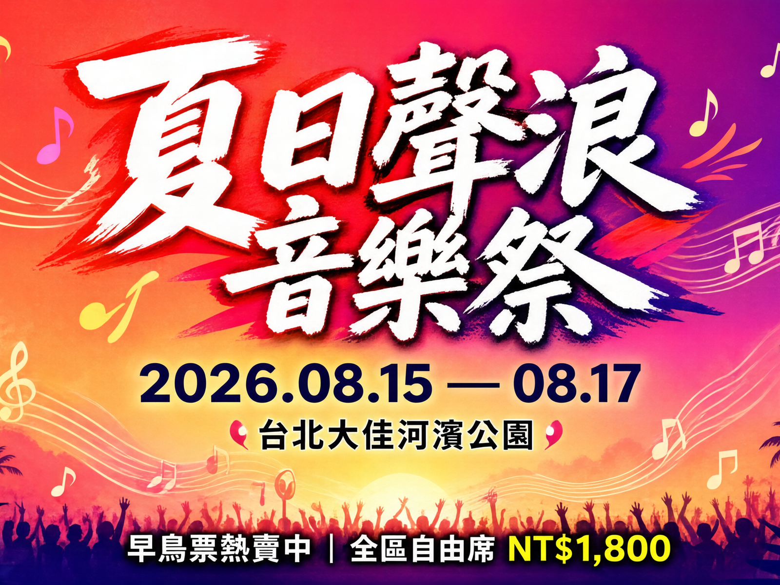
Prompt 是一張音樂節海報,地點「台北大佳河濱公園」。五個模型,每個出 4 張圖,共 20 張 — 沒有一張把「濱」寫對。
17 筆畫的「濱」是這次測試中最具代表性的死亡字。它不是冷僻字,在台灣地名中隨處可見,但目前所有開源模型都無法正確渲染。
實用場景也翻車

實用場景翻車:「兩廳雙衛」四個字,沒有模型全對
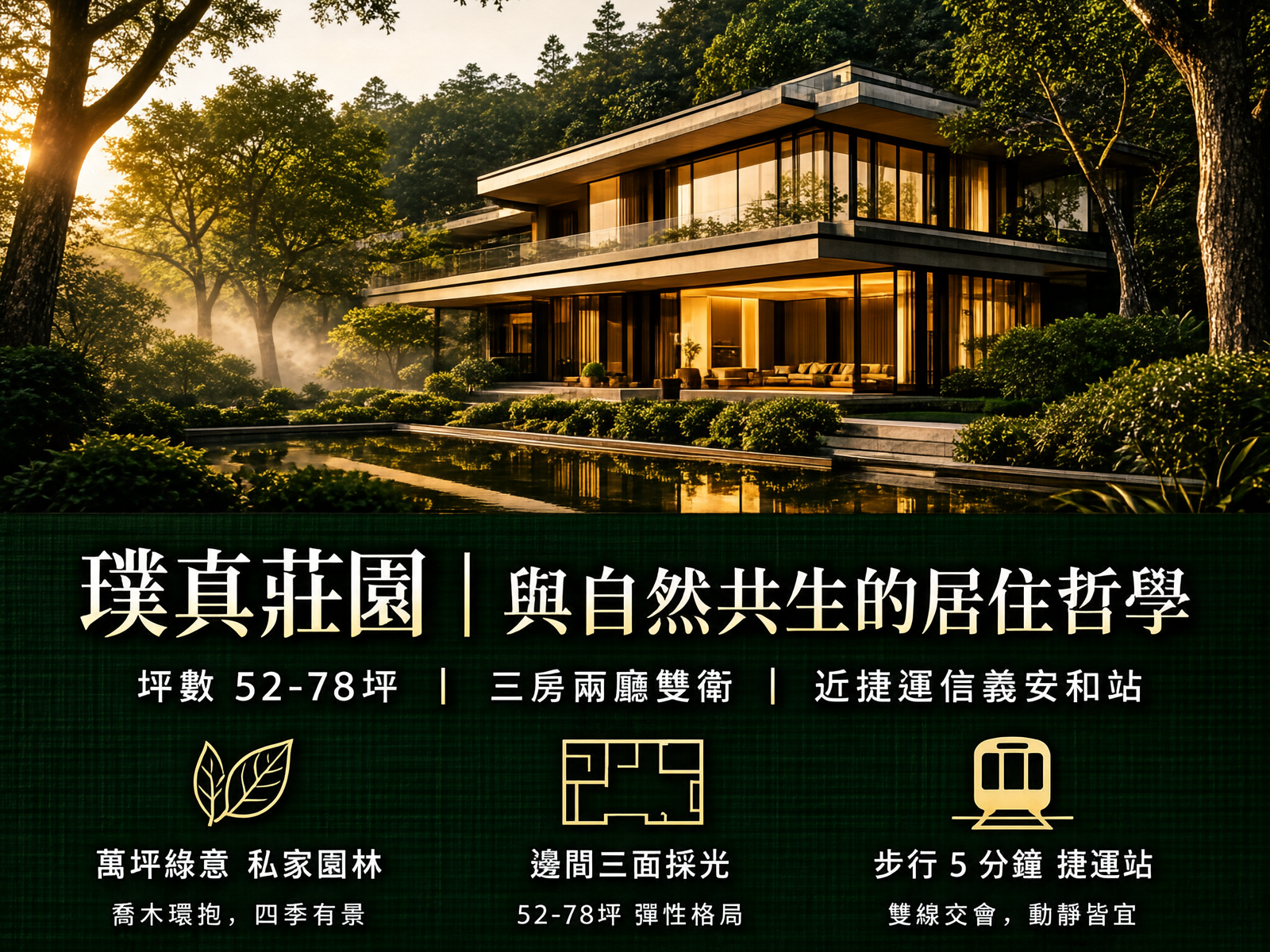
房地產廣告是最常見的商業應用場景。「兩廳雙衛」— 25 筆畫的「廳」和 16 筆畫的「衛」,讓所有模型都栽了跟頭。
這意味著:如果你想用 AI 出圖做房地產廣告,文字部分目前必須後期手動加上。
最有趣的發現
五模型全畫竹子

超現實理解力:台北 101 從茶杯長出 → 五模型全畫成竹子
這是整個測試中最好笑的結果。Prompt 要求「台北 101 像竹筍一樣從茶杯中長出來」,結果五個模型不約而同地 — 直接畫了竹子。
模型讀到「竹筍」就直接畫竹子,完全忽略了 101 大樓的概念。這不是文字渲染的問題,而是語義理解的極限。
構圖想像力:誰理解了「顛倒」?

構圖想像力:Qwen、KREA 2、Z-Image 部分表達出顛倒世界,但沒有模型完全做對
Prompt 要求一個天地顛倒的夜市場景 — 地面是天空,天空是海洋。這是對模型抽象理解能力的極限測試。
Qwen-Image-2512、KREA 2 Turbo 和 Z-Image 都在畫面中部分表達出了顛倒的概念,但沒有任何模型完全實現 prompt 描述的效果。ERNIE 和 Boogu 則給出了完全正常視角的夜市。這組測試說明:即使是構圖理解力較強的模型,面對高度抽象的空間概念仍然力不從心。
繁簡混淆:比你想的更嚴重
字形混淆大觀

字形混淆:同一個「投」字,Qwen 寫成「授」、Z-Image 寫成「拾」
品牌識別卡上的「南投鹿谷」,看似簡單的「投」字,卻暴露了不同模型的混淆方向:
- Qwen:「投」→「授」(多了提手旁的右邊部分)
- Z-Image:「投」→「拾」(完全不同的字)
- ERNIE:「八」→「公」「尺」「會」(另一種混淆模式)
同一個字,不同模型犯不同的錯。這說明繁簡混淆不只是「訓練資料不夠」的問題,而是模型對字形的理解方式根本不同。
Z-Image 繁簡混淆最嚴重

西方奇幻書封:Z-Image 的「燒」「盡」「憶」全部輸出簡體字
Z-Image 在這組測試中暴露了最嚴重的繁簡混淆問題。「燒」「盡」「憶」三個字全部輸出簡體。加上其他場景中的「獻」「遠」「靈」「濟」「數」「慶」「購」,Z-Image 是五模型中繁簡混淆最頻繁的。
LongTextBench 0.936 vs ERNIE 的 0.964 — 這 0.028 的差距,在繁體中文場景中被放大成了顯著的品質落差。
美感與細節
賽博龐克的氛圍誰最好?

遠處小字 + 美感:霓虹招牌文字全崩,但氛圍誰最好?
五個模型的霓虹招牌文字無一正確 — 遠處小字是所有模型的共同弱點。但拋開文字不談,這組的美感差異非常明顯。哪個模型的賽博龐克氛圍最對味,每個人心中可能有不同的答案。
廢墟美學

廢墟美學:「仁濟醫院」——「醫」「濟」高筆畫字的繁簡混淆考驗
日治時期廢棄醫院的場景,「醫」(18 筆畫)和「濟」(18 筆畫)雙重考驗。Z-Image 把「濟」輸出為簡體,其他模型也各有各的翻車方式。但在氛圍營造上,每個模型都展現了不同的廢墟美學詮釋。
食物誰最像?

食物寫實度與文字標註:各模型各有優缺點
「蚵」字五個模型都寫不出來,但有趣的是各模型的問題方向不同 — 有些是食物本身不像現實(造型、質感失真),有些是文字標註和食物對不上(明明寫著「蚵仔煎」旁邊卻放了別的東西)。沒有哪個模型在這組測試中全面勝出,反而暴露了 T2I 模型在「圖文一致性」上的共通弱點。
80 年代台北

復古懷舊:媽媽騎機車載兩個小孩——Boogu 和 Z-Image 做對了
這組的亮點不在文字(招牌字筆畫多的都容易錯),而在人物構圖。「媽媽騎機車載著兩個小孩」這個充滿台灣味的場景,Boogu 和 Z-Image 正確呈現了,反而 ERNIE 和 Qwen 在人物位置上出了問題。
武俠漫畫

武俠漫畫跨頁:「斬」字的繁簡體之爭 — ERNIE 無論如何只出簡體
漫畫分鏡是對模型的綜合考驗 — 動態構圖、速度線、音效文字、對話框,每一項都是挑戰。「斬」這個字在 ERNIE 上無論抽多少次卡都只出簡體,暴露了模型在特定字上的系統性偏差。
純美感對決

拿掉文字壓力後,純美感誰最強?
當 prompt 完全沒有文字需求時,模型們終於可以全力發揮美感。人像攝影的膚質、光影、景深、情緒表達 — 這是你選擇模型時,除了文字能力之外最需要考慮的維度。
結論:該選哪個?
最終排名
| 排名 | 模型 | 文字渲染 | 繁簡混淆 | 構圖想像力 | 推薦場景 |
|---|---|---|---|---|---|
| 🥇 | ERNIE Turbo | ⭐⭐⭐ | 少量 | ⭐⭐ | 海報標題、名片、短文字設計 |
| 🥈 | Qwen-2512 | ⭐⭐⭐ | 中等 | ⭐⭐⭐ | 需要創意構圖的場景 |
| 🥉 | Boogu Base | ⭐⭐ | 少量 | ⭐⭐ | 美食攝影、寫實場景 |
| 4 | Z-Image | ⭐⭐ | 最嚴重 | ⭐⭐ | 快速出圖、不需要繁體文字時 |
| 5 | KREA 2 Turbo | 💀 | — | ⭐⭐⭐⭐ | 純美感、完全不需要中文字時 |
實用建議
- **大標題(4 字以內)**→ ERNIE 或 Qwen,成功率最高
- 需要繁體中文長文→ 目前沒有模型能勝任,請後期手動加字
- 追求構圖創意→ Qwen,想像力明顯領先
- 追求純美感→ KREA 2,但文字部分全部後期處理
- 快速大量出圖→ Z-Image,但要注意繁簡混淆
全模型共同死亡字
以下繁體字,目前沒有任何開源模型能穩定渲染:
濱(17畫)、廳(25畫)、衛(16畫)、蚵(10畫)、闊(12畫)、膚(15畫)
最後的話
LongTextBench 0.96 分聽起來很厲害,但那是簡體中文的成績。面對繁體中文,尤其是筆畫多的字、密集排版、遠處小字,目前所有開源模型都還有明顯的進步空間。
好消息是:短文字、大標題、簡單結構的場景已經堪用。壞消息是:任何需要大量正確繁體中文的設計,文字部分請務必後期手動處理。
AI 畫得出「濱」這個字嗎?2026 年的答案是:還不行。但我相信這只是時間問題。
附錄:Prompt 分享(節錄 14 組)
以下是本次評比中使用的 14 組 prompt,歡迎自行測試。統一設定 1024×1024,每組建議至少出 4 張挑選。完整 53 組 prompt(含中文說明)在〈繁體中文 AI 生圖測試 Prompt:53 組全公開〉。
F18. 浮世繪風格台北
A modern ukiyo-e style illustration of Taipei 101 tower during cherry blossom season. Title cartouche in Traditional Chinese: "台北春景圖". Stylized clouds and waves in traditional Japanese woodblock print style, but depicting Taiwanese scenery. Cherry blossom petals floating in the wind. Traditional color palette: indigo blue, coral red, sage green, and ivory white.
B5. 名片設計
A modern minimal business card design. Front side: name "林書涵" in large Traditional Chinese, below "資深品牌設計師 Senior Brand Designer", company "光點設計有限公司", email "shu.han@lightdot.design", phone "+886-2-2771-8899". Clean white background with a single coral accent line. Elegant sans-serif typography.
A2. 音樂節海報
A vibrant summer music festival poster. Title "夏日聲浪音樂祭" in bold brush-style Traditional Chinese calligraphy at the top. Date "2026.08.15 — 08.17" below. Location "台北大佳河濱公園". Tropical gradient background from coral pink to deep purple, palm tree silhouettes, floating music notes. Bottom text: "早鳥票熱賣中|全區自由席 NT$1,800"
B6. 房地產廣告
A premium real estate advertisement. Headline "璞真莊園|與自然共生的居住哲學" in gold Traditional Chinese text on dark forest green background. Subheading "坪數 52-78坪 | 三房兩廳雙衛 | 近捷運信義安和站". Bottom: "預約賞屋專線 02-8888-6666". Architectural rendering of a modern building surrounded by trees. Luxurious atmosphere with warm golden hour lighting.
H25. 超現實台北
A surrealist cityscape where Taipei 101 is growing like a giant bamboo shoot from a teacup. Traditional Chinese text on the teacup reads "台北不思議". Tiny people with umbrellas walking on the saucer edge. MRT trains flying through the sky like ribbons. Cloud-shaped cotton candy replacing real clouds. Dalí meets Taiwanese daily life. Warm afternoon light, dreamy soft focus, pastel color palette with pops of vermillion red.
H26. 顛倒夜市
An upside-down world illustration. A Traditional Chinese night market scene — but the ground is the sky and the sky is an ocean. Vendors selling "天空滷味" and "倒掛珍奶" with signs in handwritten Traditional Chinese. Lanterns hanging upward into the water. Fish swimming among the market stalls. A girl standing at the boundary looking up (or down?) at her own reflection. MC Escher-inspired impossible geometry meets Taiwanese street culture. Warm tungsten and cool moonlight contrast.
E14. 品牌識別卡
A brand identity card for a tea company. Logo text "山嵐茶莊 MISTY RIDGE TEA" centered. Tagline "海拔一千二百公尺的甘甜" below. Founded "創立於一九八七年 · 南投鹿谷". Elegant botanical illustration of tea leaves framing the text. Color palette: forest green, antique gold, cream white. Textured cotton paper feel.
G22. 西方奇幻書封
A high fantasy book cover. A massive dragon perched on a crumbling gothic cathedral, wings spread against a blood-red sunset sky. Title "龍焰編年史" in weathered stone-carved Traditional Chinese characters. Subtitle "當世界燃燒殆盡,唯有記憶不朽" in smaller elegant text. Author name "葉秋白 著". Dark fantasy atmosphere with volumetric god rays piercing through storm clouds. Rich oil painting texture.
F17. 賽博龐克霓虹
A cyberpunk night street scene in a Taiwanese city. Multiple neon signs in Traditional Chinese: "龍鳳大酒樓"、"二十四小時營業"、"檳榔西施"、"卡拉OK". Rain-slicked streets reflecting the neon glow. A figure with an umbrella walking through steam. Blade Runner-inspired atmosphere with cyan, magenta, and warm amber neon colors. Cinematic wide-angle composition.
I32. 廢墟美學
A hauntingly beautiful photograph of an abandoned Japanese-era hospital in Taiwan, overgrown with tropical vegetation. Faded Traditional Chinese sign above the entrance: "仁濟醫院 — 昭和十二年設立". Peeling paint, broken windows with vines creeping through. A single white chair in the center of a collapsed ward, eerily clean among the decay. Dust particles floating in a shaft of golden afternoon light. Melancholic rather than scary — beauty in decay. Desaturated warm tones with high contrast shadows. Cinematic 2.39:1 aspect ratio feel.
D11. 台灣美食攝影
An overhead food photography shot of a Taiwanese street food spread. Text overlay "夜市味覺地圖" in playful handwritten Traditional Chinese style at the top. Items labeled: "蚵仔煎"、"臭豆腐"、"珍珠奶茶"、"滷肉飯". Warm tungsten lighting, shallow depth of field on the bubble tea, steam rising from the oyster omelette. Rich saturated colors.
O44. 80年代台北街景
A vintage-style photograph recreating 1980s Taipei. A narrow street lined with old apartment buildings, rooftop water tanks, and tangled electrical wires. A red-and-white taxi (裕隆 Nissan) parked on the street. Shop signs in Traditional Chinese: "金乃美理髮廳"、"大乘中藥行"、"國術館". A mother on a motorcycle with two kids (no helmets — era-accurate). Kodak Portra 400 film simulation — warm highlights, lifted shadows, slight grain. Faded colors with emphasis on warm oranges and muted greens. Slight vignetting at corners. Nostalgic but not overly filtered. Documentary street photography composition.
L39. 武俠漫畫跨頁
A dramatic manga-style double-page spread. A swordsman in traditional wuxia robes leaping through the air, slashing through a rain of cherry blossom petals. Motion lines radiating from the sword strike. Sound effect text "斬!" rendered in large, dynamic Traditional Chinese brush-style lettering with impact lines. A speech bubble from below: "你的劍,還不夠快。" Dramatic low-angle composition. High contrast black and white with selective red on the sword edge and petals. Professional manga panel layout with speed lines and dramatic foreshortening.
J34. 自然光人像
A portrait photograph of a Taiwanese woman in her late 20s, sitting by a window in a sunlit café. Natural side lighting illuminating her face, catching individual strands of hair. She has a gentle, contemplative expression, looking slightly off-camera. Wearing a cream linen blouse. Visible skin texture — pores, subtle freckles on the nose bridge. Bokeh background of warm café interior. Shot on 85mm f/1.4 lens. Color palette: warm golden tones with soft shadows. No text overlay — pure portrait quality test.
相關文章
- SenseNova U1.5 繁體中文實測:「濱」終於有模型寫對了 — 同一套題庫的後續測試,本文的死亡字首度被寫對
- SenseNova 官方 Prompt 增強實測 — 同 seed A/B,看 prompt 改寫對資訊密集版面能救多少
- 繁體中文 AI 生圖測試 Prompt:53 組全公開 — 本文題庫正本,附 JSON 下載與評分表
- Krea 2 vs Midjourney — 不是誰比較好,而是什麼時候用誰 — 11 組併排對比,畫出使用場景地圖
- KREA 2 實測:中文 Prompt 能用嗎?四種官方 LoRA 風格全比較 — 中文 Prompt 實測 + 原版四個 LoRA 風格比較
- KREA 2 新增 8 種 LoRA 風格全比較:從復古動漫到兒童塗鴉 — 官方更新後的 9 個 LoRA 完整實測
測試日期:2026 年 6 月|2026-09-10 更新:補測試條件表與後續測試入口,評比結論未變