The experiment
My brand mark is a handwritten "TingYu's Deco" — brushy, connected, personal. I wanted it to become more than a PNG: a real brand font I could type with, on the website, on packaging, in social headers.
So I ran an experiment. The same brief went to three AI coding agents — Claude, Codex, and Grok: take my logo, turn it into a brand font family. No further art direction. Each agent worked in its own folder, wrote its own build pipeline, shipped its own font binaries.
Three agents went in. Four font families came out. And yes — I compared the files before writing this post: the three deliverables are genuinely independent work, not copies of each other.
實驗設計
我的品牌字標是一行手寫的「TingYu's Deco」——筆刷感、連筆、很個人。我一直想讓它不只是一張 PNG,而是一套真的能打字的品牌字型:網站、包裝、社群標題都用得上。
於是做了個實驗:同一份需求丟給三個 AI coding agent——Claude、Codex、Grok。「把我的 Logo 延伸成品牌字型家族」,不給更多美術指導。每個 agent 各自一個資料夾、各自寫建置管線、各自交出字型檔。
三個 agent 進去,四條字型路線出來。動筆前我也核對過:三套交出來的字型檔內容完全不同,是各自獨立做出來的,不是誰抄誰的副本。
Two fonts, not one
Here's the first interesting convergence: all three agents independently split the job into two fonts.
The Logo Cut is the faithful mark. Type TingYu's Deco in any app with the font installed, and the letters transform into the exact logo drawing, curve for curve — the original lettering lives inside the font itself.
The Display Cut is the typable companion: a full alphabet that feels like the logo but works for any short text — headlines, quotes, packaging labels.
That split is exactly how human type designers approach wordmark-to-font projects. Nobody told the agents to do it. All three arrived there on their own.
兩套字型,不是一套
第一個有趣的收斂點:三個 agent 不約而同把任務拆成兩套字型。
Logo Cut 是忠實字標。裝好字型後,在任何軟體打出 TingYu's Deco 這串字,它會自動變成和 Logo 一模一樣的圖形,一筆一畫都不差——因為原始字跡就藏在字型檔裡面。
Display Cut 是可打字的姊妹作:一套完整的英文字母,「感覺像 Logo」但什麼短句都能排——標題、引言、包裝小標。
這個拆法正是人類字體設計師處理「字標延伸字型」的標準做法。沒有人教它們,三家自己走到了同一個架構。
The ceiling: you can't fake handwriting with math
The divergence — and the honest failures — started with the Display Cut.
Grok's first attempt generated the companion font with procedural geometry: code that simulates handwritten strokes. Its own README calls the verdict: legibility and beauty both fell short. Faking a hand with math hits a ceiling fast.
Codex was upfront about the same limit from day one — its README explicitly warns that the Display Cut "should not be claimed as fully original or exclusive."
So all three agents converged on the same honest workaround: start from an existing open-licensed script font (SIL OFL), rebrand it, and tune it toward the logo. Which turned the whole project into a different, more interesting question…
天花板:手寫感沒辦法用數學偽造
分歧——以及誠實的失敗——從 Display Cut 開始。
Grok 的第一版用程式幾何直接「生成」手寫筆畫,用程式碼模擬手寫。它自己的 README 就寫了結論:可讀性與美感都不足。用數學偽造一隻手,天花板來得很快。
Codex 從第一天就把話講明白:README 直接警告 Display Cut「不應宣稱為完全原創或獨家字型」。
於是三家收斂到同一條誠實的路:從既有的開源手寫字型(SIL OFL 授權)出發,重新命名、往 Logo 的方向調整。這讓整個實驗變成另一個更有趣的問題——
Picking a base is a taste decision
If everyone derives from an existing handwriting font, the real question becomes: which one? That's not an engineering decision. That's a reading of the logo's personality — and the three agents read it three different ways.
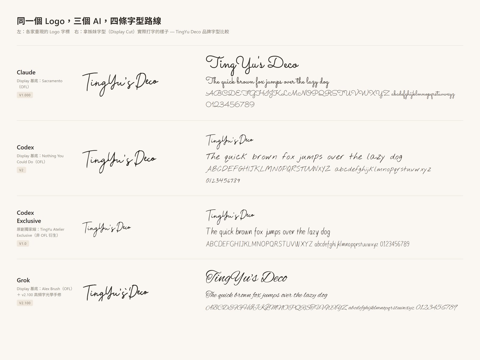
Here are all four results side by side. Same sentence, four flavors — the left column is the logo mark each font reproduces, the right column is what you get when you type with it:

- Claude picked Sacramento — a clean, thin-lined signature script. Its reading: the logo is elegant and flowing, so the companion should be light and rhythmic.
- Codex picked Nothing You Could Do — a casual real-pen handwriting font. Its reading: the logo is personal and imperfect, so the companion should feel like a note someone actually wrote.
- Grok picked Alex Brush — a bold, connected brush script. Its reading: the logo is brush lettering, so the companion should keep that ink weight and connected rhythm.
Grok's process was the most designer-like of the three. It didn't just pick a font — it first lined up six candidates, each typing out the brand name, under the logo for comparison. In the image below, the top row is my original logo; below it are the six candidates. You can see why Alex Brush won: it's the only one with the same heavy, inky brush feel:

And picking wasn't the end. Grok then hand-adjusted the letters to look even more like the logo. In the image below, top is the original Alex Brush, middle is Grok's adjusted version — the letters are narrower and the capital letters lose their showy loops, moving closer to the logo's plainer, more upright hand:

Codex made a similar tuning pass on its font too, though the changes are subtler — mostly letter widths and spacing.
Three defensible answers to the same question. If you asked three human designers, you'd get the same kind of spread.
挑基底,是品味決策
既然大家都從既有手寫字型衍生,真正的問題就變成:*挑哪一套?*這不是工程決策,是對 Logo 性格的「閱讀」——而三個 agent 讀出了三種答案。
先看上面那張四路線並排圖:左欄是各家重現的 Logo 字標,右欄是拿它們實際打字的樣子。同一句話,四種味道。
- Claude 選 Sacramento——線條細、乾淨的簽名體。它的閱讀是:這個 Logo 優雅流動,姊妹字型該輕盈、有節奏。
- Codex 選 Nothing You Could Do——隨性的真實手寫體。它的閱讀是:這個 Logo 個人、不完美,姊妹字型該像某人真的寫下的筆記。
- Grok 選 Alex Brush——筆畫粗、連筆的毛筆感字體。它的閱讀是:這個 Logo 本來就是筆刷字,姊妹字型該保留墨水的重量和連筆的韻律。
過程中最像設計師的是 Grok。它不是直接挑,而是先讓六套候選字型各排一次品牌名,放在 Logo 原稿下面比對(上面第二張圖:最上方是我的 Logo 原稿,下面六排是候選字型)。看圖就懂 Alex Brush 為什麼勝出——只有它有同樣濃、同樣有墨水感的筆畫。
選完也沒停手。Grok 接著手動調整字母,讓它更像 Logo(上面第三張圖:上排是 Alex Brush 原版,中排是調整後——字母收窄了、開頭大寫少了華麗的圈圈,更接近 Logo 那種樸素直挺的手感)。Codex 也對自己的字型做了一輪類似微調,只是變化更細微,主要在字寬和間距。
同一個問題,三個都站得住腳的答案。拿去問三位人類設計師,大概也是這樣的分布。
The wildcard: building from scratch anyway
Codex did one thing nobody asked for: alongside its OFL-derived Display Cut, it opened a second line — TingYu Atelier Exclusive, an original font built from scratch, not derived from any existing typeface. It went through three versions (v0.1 → v0.2 → v1.0), complete with stroke-topology tests in the build pipeline.
Look at the specimen above: the Exclusive cut is noticeably tamer than the logo — neat, legible, a bit careful. That's what "original" costs. Deriving from Alex Brush buys you 60+ years of accumulated script-font craft for free; starting from zero means every curve is your own problem. The gap between Grok's tuned Alex Brush and Codex's from-scratch Exclusive is the clearest picture I have of how far AI type design can currently reach without standing on someone's shoulders.
番外:還是有人選擇從零開始
Codex 做了一件沒人要求的事:在 OFL 衍生的 Display Cut 之外,另開一條原創線——TingYu Atelier Exclusive,不衍生自任何既有字型、從零起筆,一路迭代了三版(v0.1 → v0.2 → v1.0),建置管線裡甚至有筆畫拓撲測試。
回頭看上面的 specimen:Exclusive 這條線明顯比 Logo 溫馴——工整、可讀、有點小心翼翼。這就是「原創」的代價。衍生自 Alex Brush 等於免費繼承了手寫字型累積數十年的工藝;從零開始,每一條曲線都是自己的問題。Grok 手修版和 Codex 原創版之間的落差,是我看過對「AI 字型設計不站在巨人肩膀上能走多遠」最清楚的一張圖。
Licensing is the real deep water
Here's the part that would bite hardest in production, and all three agents handled it more carefully than I expected.
The SIL Open Font License allows derivatives — but with rules. Reserved Font Names mean your derivative must be renamed (none of the three ships anything called "Alex Brush" or "Sacramento"). The OFL text must ship with the fonts. And you can't claim the derived font as fully original.
So every package landed on the same two-track licensing: the Logo Cut is proprietary (it's vectorized from my own artwork), while the Display Cut is OFL with full disclosure of its base font. Grok's README states it in bold: "Display is not an original exclusive typeface." Codex ships a separate license file for each track.
I've been burned before by checking licenses after building — an AGPL background-removal library and a non-commercial ML model both had to be swapped out of a project last week. Watching three AIs get font licensing right by default was quietly the most reassuring part of the whole experiment.
授權才是真正的深水區
這是實務上最容易咬人的部分,而三個 agent 處理得都比我預期謹慎。
SIL 開源字型授權(OFL)允許衍生——但有規則。Reserved Font Name 機制要求衍生版必須改名(三家交付物裡沒有任何檔案叫 "Alex Brush" 或 "Sacramento");OFL 條款全文必須隨字型附上;而且不能宣稱衍生字型是完全原創。
於是每一包都收斂到同一種雙軌授權:Logo Cut 專有(從我自己的字標向量化而來),Display Cut 走 OFL 並完整揭露基底來源。Grok 的 README 直接粗體寫「Display 不是原創獨家字型」;Codex 為兩軌各附一份授權檔。
我自己踩過「先做再查授權」的坑——上週才把一個 AGPL 去背函式庫和一個非商用 ML 模型從專案裡換掉。看著三個 AI 預設就把字型授權做對,是整個實驗裡最讓人安心的一段。
What automates, and what doesn't
The grunt work automates beautifully. Tracing the logo image into clean vector outlines, packaging the fonts in every format a computer or website needs, wiring up the type-the-brand-name-get-the-logo trick, printing out comparison sheets, even opening a browser by itself to double-check that what you type really matches the original mark — all three agents did all of it, unattended.
What doesn't automate is judgment. Which base font matches the logo's personality. Whether a capital's flourish is charming or noisy. Whether "original" is worth the quality cost. Every fork in this experiment that produced a different answer was a taste decision, and every one that produced the same answer was engineering.
My own verdict, since a comparison post owes one: Grok's hand-tuned Alex Brush cut reads closest to the logo's brush personality, and it's what I'd put on brand materials. Claude's Sacramento cut is the most legible and the one I'd use for longer UI text. Codex's Exclusive line is the most interesting direction — the only one that could someday be truly mine — but v1.0 isn't there yet.
One logo went in. Four fonts came out. The machines built everything — and the choices, it turns out, were the product.
能自動化的,和不能的
粗活的部分自動化得漂亮:把 Logo 圖片描成乾淨的向量線條、打包成電腦和網站要用的各種字型格式、裝好「打品牌名自動變字標」的機關、輸出比對用的校樣圖,甚至自己打開瀏覽器檢查打出來的結果跟原稿像不像——三個 agent 全部無人看管地做完了。
自動化不了的是判斷。哪套基底貼合 Logo 的性格、大寫的花筆是迷人還是吵、「原創」值不值得付出品質代價——這個實驗裡每一個產生不同答案的分岔都是品味決策,每一個產生相同答案的地方都是工程。
比較文欠讀者一個結論,我的裁決是:Grok 手修版的 Alex Brush 最貼近 Logo 的筆刷性格,品牌物料我會用它;Claude 的 Sacramento 版可讀性最好,較長的 UI 文字我會選它;Codex 的 Exclusive 線是最有趣的方向——唯一有機會真正屬於我的一套——但 v1.0 還沒到位。
一個 Logo 進去,四套字型出來。機器把所有東西都做完了——結果發現,「選擇」才是產品。