A small experiment in living text
Where it started
I saw a demo where a dragon follows your cursor across a medieval manuscript page. As the dragon moves, the text reflows around it — not after a delay, not with a stutter, but instantly, line by line. The dragon was beautiful, but the text was the magic.
The demo was built on a text-layout engine called Pretext by Cheng Lou. I can't read the code, but I understood the demo's superpower immediately: text that rearranges itself around a moving object, smoothly, every instant — something web pages are normally terrible at.
I stared at it for twenty minutes. Then I thought: I want one of these on my site.
看到龍的那一刻
有人做了一個互動手抄本 demo——滑鼠移動,龍跟著走,文字即時繞開龍的身體重新排版。不是跳一下、刷新一次那種,是每一行都在流動。
老實說,龍畫得很精緻,但真正讓我盯著看二十分鐘的是文字。那些字像水一樣流過障礙物,又像有自己的意志一樣找到新的位置。
demo 背後用的是一個叫 Pretext 的排版引擎。程式碼我看不懂,但它厲害在哪我一看就懂:讓文字繞著一個正在移動的東西即時重排,順到完全不卡——這正是網頁平常最不擅長的事。
我當下就決定:我要在自己網站上做一個。
Why this is hard (in plain words)
Text wrapping sounds trivial — every web page wraps text automatically. But that automatic wrapping is built for text that sits still. Ask a page to re-wrap a whole passage sixty times a second around a moving object, and it grinds. That's why you almost never see this effect on the web.
Pretext's trick, as I understand it: instead of asking the browser to redo its slow layout work every instant, it measures every letter once, then does quick arithmetic to figure out how much text fits on each line. Math is fast; that's the whole secret.
So I handed the demo link and the Pretext repo to AI: "make me one of these, but mine." The AI wired it all together. What I owned was everything you actually see.
為什麼這很難(白話版)
「文字繞排」聽起來很簡單——每個網頁不是天天在自動換行嗎?但那套自動換行是為靜止的文字設計的。要一段文字每秒六十次繞著移動中的東西重新排版,網頁就會卡頓。所以這種效果在網路上幾乎看不到。
Pretext 的聰明之處(以我能理解的程度):它不叫瀏覽器每一瞬間重做那套很慢的排版工作,而是先把每個字的寬度量好一次,之後每行文字能放幾個字就變成簡單的算術。算術很快,秘訣就這麼簡單。
於是我把 demo 連結和 Pretext 的 repo 一起丟給 AI:「幫我做一個這個,但要是我的版本。」程式接線全是 AI 做的。我負責的,是你眼睛看得到的一切。
Four versions of a vine
The hardest part wasn't the text reflow — that was solved before I arrived. The hardest part was making the thing the text flows around look right. This took four rounds, and every verdict was mine.
v1 — Ink blots. Procedural circles following the cursor. Looked like someone sneezed on the manuscript. Deleted in ten minutes.
v2 — AI-generated stamps. I used gpt-image-2 to generate four botanical illustrations in manuscript style. They looked beautiful in isolation — but strung along a mouse trail, they felt like stickers slapped onto parchment. Discrete images can't form a continuous path. Each one had a visible rectangular edge.
v3 — Smooth curves + AI flowers. Better idea: continuous hand-drawn-style curves for the vine, AI flowers for decoration. But the vines were too mechanical — uniform width, perfectly smooth, no personality. It looked like a vector diagram, not a plant.
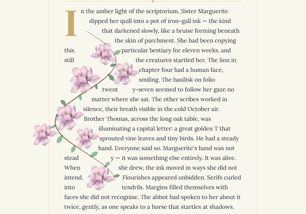
v4 — Organic vines. Width varies along the curve. A subtle random wobble gives each segment a hand-drawn feel. Knots appear at intervals where leaves and tendrils branch off. And the flowers? The AI ones are gone. Just one image — the magnolia I painted myself in Procreate, the same one on my About page — rotated and scaled randomly along the vine.
This version worked because it stopped trying to look drawn and started trying to look grown.
四版藤蔓
技術問題在我出現之前就被解決了,接下來是美感的問題——文字要繞開的那個東西,到底長什麼樣?這來回了四版,每一版的生死都是我判的。
第一版:墨跡圓斑。 一顆顆圓形跟著滑鼠走。醜到像打翻墨水。十分鐘就砍了。
第二版:AI 生圖印章。 用 gpt-image-2 生了四張手抄本風格的植物插圖,每張單獨看都很漂亮。但串在滑鼠軌跡上就不行了——一張一張分開的圖片沒辦法形成連續路徑,每張都有明顯的方框邊界。看起來像在羊皮紙上貼便利貼。
第三版:平滑曲線 + AI 花朵。 邏輯對了——用連續的曲線畫藤蔓,AI 花朵當裝飾。但藤蔓太生硬,等粗、太平滑、沒有生命感。像繪圖軟體裡的向量線條,不像植物。
第四版:有機藤蔓。 粗細沿著曲線漸變,每一段加上細微的隨機抖動做出手繪感,間隔放結節讓葉片和捲鬚能長出來。花也換掉了——AI 花朵全部退場,只留一張我自己用 Procreate 畫的玉蘭花(就是 About 頁那朵),隨機旋轉和縮放撒在藤蔓沿線。
這一版成功了,因為它不再試圖看起來像畫出來的,而是像長出來的。
Making it mine
The original demo had a medieval story about a scribe named Sister Marguerite. It fit the dragon. But I wasn't making a dragon — I was growing magnolias.
So I wrote about the magnolia itself. Ninety million years old — older than bees. Petals thick as porcelain. A fragrance that arrives before the tree is visible. A bloom that lasts two weeks and holds nothing back.
The palette is the same Classical Morandi I use across the site — cream canvas, gold accents, chocolate vines, sage leaves. The drop cap is Playfair Display. The body text is Lora. It looks like it belongs here, because it does.
從龍到玉蘭花
原版 demo 的文字是一個修道院抄寫員的中世紀故事,配龍很搭。但我做的不是龍——我在長玉蘭花。
所以我寫了一篇關於玉蘭花的散文。九千萬年前就存在了,比蜜蜂還早。花瓣厚得像瓷器,光線穿過去會變成教堂玻璃的顏色。花期只有兩個禮拜,盛放的時候什麼都不保留,然後就安靜地落下來。
配色用的是網站統一的莫蘭迪色系——奶油白底、金色線條、巧克力色藤蔓、灰綠葉片。首字放大用 Playfair Display,內文用 Lora。它看起來就像一直屬於這裡。
因為它確實屬於這裡。
Try it
Move your cursor across the page. Watch the vines grow. Watch the text move.
— TingYu's Deco
Growing Vines on a Manuscript · 2026 · Taiwan