Mage-Flow 是什麼?
Mage-Flow 是微軟發布的開源圖像生成模型家族,MIT 授權,只有 4B 參數——比 Krea2、Qwen-Image 這些動輒 12B、20B 的模型小了一個量級。文字編碼器用 Qwen3-VL 4B,搭配自家 VAE。Comfy-Org 已經重新打包成 ComfyUI 單檔格式,ComfyUI 0.29 之後原生支援(核心節點 TextEncodeMageFlowEdit),不需要裝任何 custom node。
HF 上的家族成員比想像中多,T2I 和 Edit 各分三階:
- Standard(
mage_flow)— 30 步、CFG 5,走傳統採樣 - Turbo(
mage_flow_turbo)— 4 步蒸餾版、CFG 1 - Base(
mage_flow_base)— 原始預訓練版,只有 bf16(本次未測) - Edit / Edit Turbo / Edit Base — 圖像編輯系列(下一篇實測)
除了 Base 之外,每個變體都有 bf16(8.23 GB)和 int8_convrot(4.16 GB)兩種精度。四個 T2I 模型全下載也不到 25 GB,這是小模型的第一個好處。
這篇回答三個問題:int8 量化犧牲了什麼?Standard 和 Turbo 怎麼選?以及——4B 的 Mage-Flow 跟 12B 級的 Krea2 差距還有多大?
快速結論
- int8 量化的代價非常小:同 seed 下構圖與細節幾乎完全一致,唯一看得出的差異是人臉細節略為模糊。檔案減半(8.23 GB → 4.16 GB),VRAM 有限的電腦可以放心選 int8
- Turbo 不是 Standard 的降級版,而是不同取向:Turbo 質感更銳利、動態表現更強(水花、雀斑、光澤細節更豐富),近照人臉明顯優於 Standard;Standard 畫面較柔和,但對細節指令的服從度更好——「閉眼」這種約束只有 Standard 穩定做到
- 輕量是 Mage-Flow 的最大優勢:4B 參數讓它在中低階顯卡上也能順暢執行,Turbo 4 步出圖的等待時間遠短於大模型,int8 版更把門檻降到入門級顯卡
- 跟 Krea2 Turbo 的差距誠實說:人臉微紋理、攝影氛圍、複雜指令的細節還原,Krea2 仍然明顯領先,動漫題的美感也是 Krea2 較佳;Mage-Flow 的強項在圖形化風格的服從度
- 該留哪個模型:VRAM 充足就留 Turbo bf16 當日常主力,需要 negative prompt 或 CFG 控制時用 Standard bf16;VRAM 有限的電腦選 Turbo int8
測試方法
- ComfyUI 0.29(V9 整合包)、1024×1024
- 35 組 prompt × 每組固定 seed,四個模型看到完全相同的文字與 seed,只換 diffusion model
- Standard:30 步 / CFG 5;Turbo:4 步 / CFG 1;都是 euler / simple
- Prompt 覆蓋插畫、油畫、黑白攝影、商品攝影、時尚街拍、動漫等 20 種以上風格域
- 對照圖從左到右固定順序:Standard bf16 → Standard int8 → Turbo bf16 → Turbo int8 → Krea2 Turbo
一個要誠實揭露的地方:第五欄的 Krea2 Turbo 圖沿用上次評比的成果(同樣 35 組 prompt、同樣 seed),但當時的管線帶 Qwen3-VL 提示詞擴寫、8 步採樣。所以跟 Krea2 的對照看「量級差距」就好,不是嚴格的同管線對決。
速度不寫絕對秒數(不同顯卡差異太大),只給相對參考:4B 模型跑 30 步,比許多大模型的蒸餾版還快;Turbo 4 步的等待時間更短。這個尺寸帶來的迭代速度,會改變你使用它的方式。
int8 vs bf16:差異有多小?
先看開場這組浣熊碼頭鬧劇。五張圖請先只看前四張:

Prompt(節錄):
A lively comedic scene on a weathered wooden jetty with a red-and-white striped lighthouse in the background... Three raccoons caught mid-chaos in one frame: (1) a proud raccoon standing upright, gripping a bowed fishing rod... (2) a sneaky younger raccoon creeping away on tiptoe with a stolen sandwich... (3) a plump old raccoon tangled head-to-toe in fishing line...
Standard 的 bf16 和 int8 幾乎是同一張圖,Turbo 的兩張也是。這不是個案——35 組全部如此,同 seed 下 int8 的構圖、配色、物件位置與 bf16 逐格一致,差異只在放大後的高頻細節。
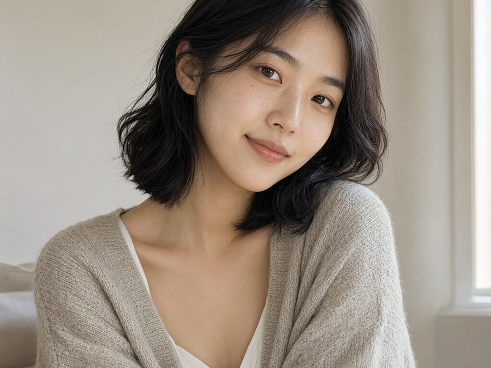
唯一穩定可見的差異在人臉。人像特寫這組看得最清楚:

Prompt(節錄):
A close-up portrait of a young Asian woman with chin-length, softly waved black hair tucked behind one ear, looking directly at the camera with gentle eyes and a subtle, calm smile; she wears an oatmeal-colored knit cardigan...
int8 的皮膚紋理比 bf16 略為模糊,睫毛與髮絲邊緣的銳利度稍低。需要並排放大才看得出來,單獨觀看幾乎沒有影響。
這段的結論:int8_convrot 量化的損失非常小。VRAM 裝得下 bf16 就用 bf16;裝不下的話,換 int8 完全值得。
順帶一提第五欄:Krea2 的人臉微紋理(毛孔、皮膚質感)還是四張 Mage-Flow 都追不上的。Mage-Flow 的人臉整體偏軟,這是它目前最明顯的弱項。
Standard vs Turbo:指令服從 vs 質感表現
兩個版本的差異比 int8 那題有趣得多。先看老漁夫這組——prompt 明確要求「face carved with deep wrinkles and eyes closed」:

Prompt(節錄):
An eerie, high-contrast black-and-white portrait of an elderly Sicilian fisherman standing waist-up on a wind-scoured shore, clutching a bundle of frayed netting, face carved with deep wrinkles and eyes closed... dramatic Rembrandt-style chiaroscuro... heavy textured impasto and visible expressionist brushstrokes...
兩張 Standard 都正確閉眼,兩張 Turbo 都把眼睛畫成半睜的瞇眼(Krea2 也睜眼了)。蒸餾版為了少步數出圖,對這種埋在長 prompt 裡的細節約束就沒那麼可靠。如果你的 prompt 常有精確的姿態、表情指令,Standard 的 CFG 5 加上真實的 negative prompt 支援會可靠得多——Turbo 的 CFG 1 會讓 negative prompt 形同虛設。
但 Turbo 也有自己的主場。香水廣告這組,prompt 要求「a crown of fine water droplets frozen mid-splash」:

Prompt(節錄):
A luxury commercial product photograph for a perfume campaign: a faceted glass bottle filled with pale amber liquid stands on a wet black marble slab, a crown of fine water droplets frozen mid-splash arcing around it... crisp twin rim lights tracing the glass edges...
Turbo int8 給了全場最戲劇化的水花皇冠,Turbo bf16 次之;兩張 Standard 的水花明顯保守,只在瓶身周圍輕輕濺了一圈。同樣的傾向也出現在人像的雀斑、嘴唇光澤、織物質感上——Turbo 給的細節更多、更銳利,Standard 則傾向柔化處理。
美妝特寫這組把兩件事同時展示出來了:

Prompt(節錄):
High-fashion beauty editorial close-up of a model with luminous deep-brown skin, slicked-back hair... glossy tangerine lips and a single line of silver foil across one eyelid; lit by a split of two colored gels, soft magenta from the left and cool cyan from the right...
Turbo 的唇部光澤和皮膚油光更接近雜誌封面的質感——近照人臉是 Turbo 對 Standard 最明顯的優勢項,35 組裡的人像特寫幾乎都是 Turbo 勝出。但注意銀箔的位置——prompt 說「across one eyelid」,四張 Mage-Flow 全部貼到了眼睛下方,只有 Krea2 貼在眼皮上。深棕膚色的還原也是 Krea2 最忠實。量級差距就藏在這種地方:4B 模型把場景都畫對了,但複雜 prompt 裡第三、四層的細節開始丟。
Mage-Flow 的主場:風格服從
上次 Krea2 微調評比我說過,微調模型有「偷渡寫實」的通病——圖形化風格會被悄悄拉回攝影質感。Mage-Flow 在這題的表現讓我意外。低多邊形狐狸:

Prompt(節錄):
A poised fox stands alert in the foreground, rendered in geometric polygonal facets of deep crimson, rust, and sharp accents of ice blue and cream... a massive pale silver moon dominates the sky, composed of layered textured panels... executed in a mosaic-like digital painting technique...
四張 Mage-Flow 的多邊形切面全部乾脆俐落,月亮的層疊質感也到位。Krea2 的版本更暗、更有繪本氛圍——更有「作品感」,但論「幾何多邊形」的字面服從度,Mage-Flow 不輸。
動漫題我原本預期會是 Mage-Flow 的強項——線條乾淨、上色平整。但多看幾眼就會發現問題。水晶蓮花這組:

Prompt(節錄):
Radial 2D Japanese anime space panorama with hairline draftsmanship and coral-violet color wedges: an adult anime heroine depicted as a moon-haired guardian stands at the heart of a kilometer-wide crystal lotus... Rendered as a meticulous long-form anime illustration built from flat chromatic planes.
四張 Mage-Flow 確實乾淨工整,但也僅止於此——構圖平淡、角色缺乏魅力,比較像「正確的動漫圖」而不是「漂亮的動漫圖」。Krea2 這張雖然偏暗、畫面較雜,整體氛圍與完成度反而更耐看,而且它是唯一畫出「四片羽翼」的。動漫風格單憑一組題目下不了定論,之後值得用一批動漫 prompt 專門測一輪,但初步印象是:動漫還是 Krea2 較佳。
復古插畫題也全員過關。狼人戰士這組五張都有 1940 年代 pulp 雜誌封面的味道:

Prompt(節錄):
Pulp noir illustration, retro sci-fi, desaturated tones, heavy shadowing, bold ink lines... A towering, heavily muscled wolf figure - a barbarian titan in form - stands center stage... Beside him, a young male scout with wind-burned skin kneels on cracked, barren ground...
Mage-Flow 四張走厚塗油畫感,Krea2 走粗獷墨線漫畫感——論「bold ink lines」的字面要求 Krea2 更貼題,但 Mage-Flow 的完成度毫不遜色。
攝影題:可用,但氛圍輸一截
時尚街拍這組,五張的服裝、單品、動作全部正確:

Prompt(節錄):
Candid off-duty fashion street snap of a tall woman striding across a zebra crossing in a European city at midday... oversized camel wool coat worn open over a graphic white tee, wide-leg pinstripe trousers and chunky white leather sneakers... shot like a paparazzi-style 35mm frame...
差在氣氛。Krea2 的柏油路質感、動態模糊、整體色調有真實的「狗仔偷拍」感;Mage-Flow 四張則乾淨得像品牌形象照——好看,但少了 prompt 要求的 candid 感。另外這種遠景小臉的清晰度,四個 Mage-Flow 變體表現差不多(都比 Krea2 模糊一些)——Turbo 的人臉優勢只在近照特寫才顯現。
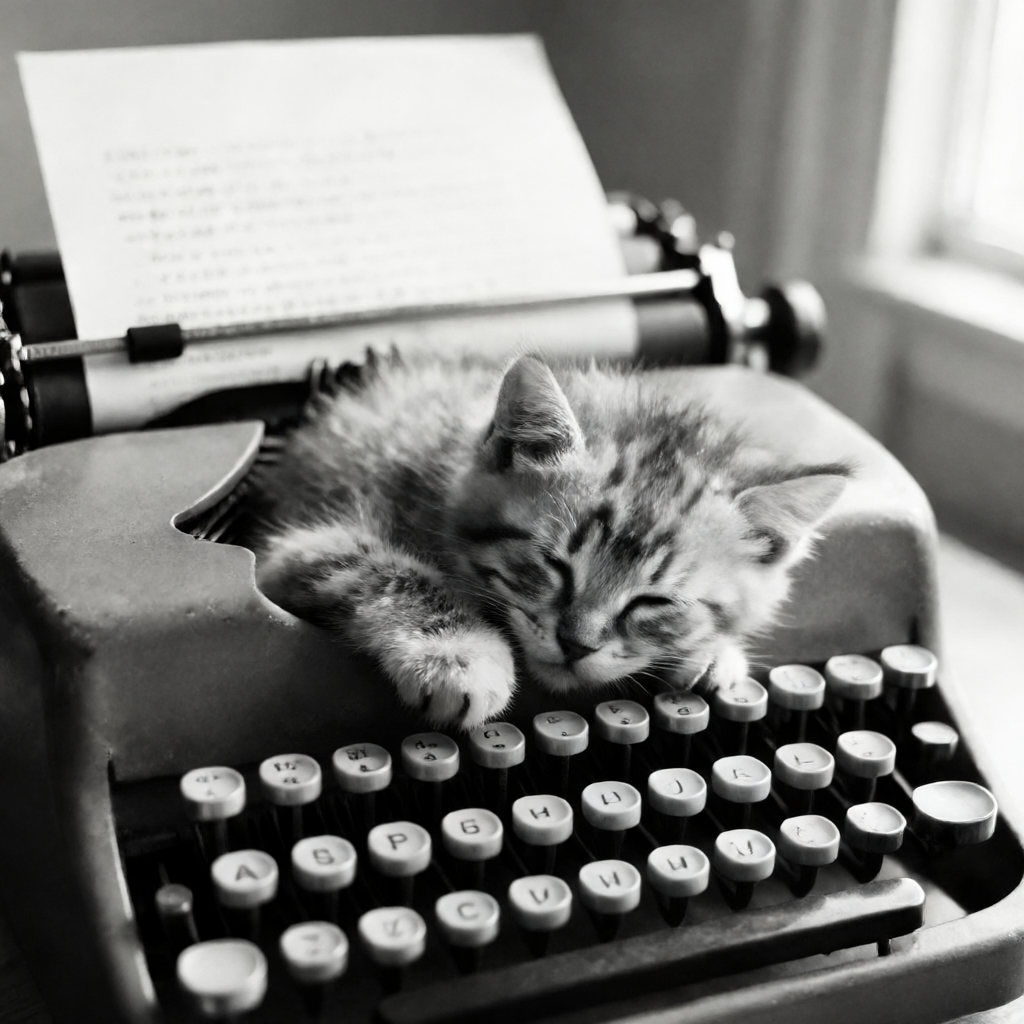
黑白攝影是同樣的情況。打字機小貓五張都成立,Turbo 的對比更強、Standard 更柔和,Krea2 則給了唯一不同的構圖詮釋和最接近底片的顆粒感:

Prompt(節錄):
A black and white photograph of a tiny fluffy kitten sleeping peacefully with its head resting on the round keys of an old manual typewriter... soft natural light streams from the right...
結論:留哪個模型?
回到最實際的問題。我的建議:
| 你的情況 | 留這個 |
|---|---|
| VRAM 充足、日常快速出圖 | Turbo bf16(質感最銳利、近照人臉最佳) |
| 需要 negative prompt / 精確指令服從 | Standard bf16(CFG 5 才有真正的負面通道) |
| VRAM 有限的電腦 | Turbo int8(代價只有人臉細節略為模糊) |
| 只想留一個 | Turbo bf16 |
跟其他開源模型的相對位置:
| 需求 | 推薦 |
|---|---|
| 人臉質感、攝影氛圍、動漫美感 | Krea2(量級優勢還在) |
| 圖形化風格、快速迭代 | Mage-Flow Turbo |
| 中英文字渲染 | Boogu |
| 極速出圖、中低階顯卡 | Mage-Flow Turbo 或 Z-Image Turbo |
Mage-Flow 最大的價值不是打贏誰,而是「4B 參數 + MIT 授權 + 極快出圖」這個組合:它小到可以當工作流裡的草稿引擎、風格探索器,或中低階顯卡上的主力。微軟把這個尺寸的模型做到這個完成度,接下來的 Edit 系列(同樣 4B、同樣三階)更值得期待——下一篇來測。
完整 35 組對照圖
前面章節已經展示過 10 組,剩下的 25 組全部放在這裡,順序照原始編號、欄位順序同上(Standard bf16 → Standard int8 → Turbo bf16 → Turbo int8 → Krea2 Turbo),歡迎慢慢欣賞、自行下判斷:


模型下載
ComfyUI 版模型統一從 Hugging Face 下載:https://huggingface.co/Comfy-Org/Mage-Flow
| 檔案 | 大小 | 放置位置 |
|---|---|---|
mage_flow_turbo_bf16.safetensors | 8.23 GB | models/diffusion_models/ |
mage_flow_turbo_int8_convrot.safetensors | 4.16 GB | models/diffusion_models/ |
mage_flow_bf16.safetensors | 8.23 GB | models/diffusion_models/ |
mage_flow_int8_convrot.safetensors | 4.16 GB | models/diffusion_models/ |
qwen3vl_4b_bf16.safetensors(或 fp8_scaled 版) | — | models/text_encoders/ |
mage_flow_vae_bf16.safetensors | 0.35 GB | models/vae/ |
Text encoder 如果你已經在用 Krea2(同樣是 Qwen3-VL 4B),不需要重複下載。
相關文章
- Krea2 微調模型大亂鬥:官方 Turbo 對決四個社群微調,35 組同 seed 實測 — 本文 Krea2 對照組的出處,含完整 35 組 prompt
- Boogu Image 0.1 實測:開源文字渲染新標竿? — 文字渲染最強的開源選手
- KREA 2 實測:中文 Prompt 能用嗎?四種官方 LoRA 風格全比較 — KREA 2 中文 Prompt 實測