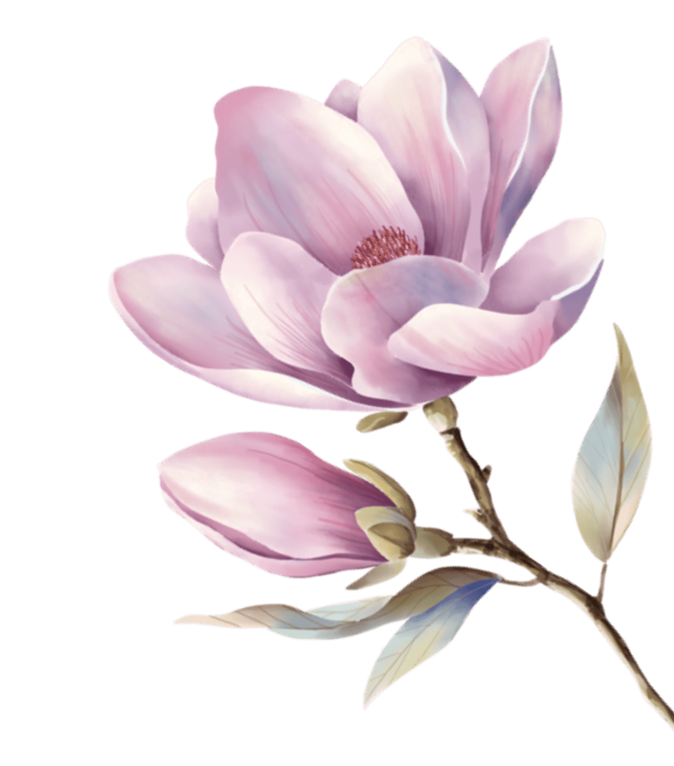
Inspired by Nicoletta Ceccoli — San Marino pop-surrealist illustrator known for porcelain-doll characters, muted pastel dreamscapes, and the art of "beautiful unease." The palette captures her signature 70/30 formula: 70% desaturated sweetness, 30% gothic darkness.
靈感來自聖馬利諾超現實插畫藝術家 Nicoletta Ceccoli — 以瓷娃娃角色、消音粉彩夢境、「美麗的不安」聞名。色彩系統捕捉她的核心配方:70% 消音甜蜜 + 30% 哥特黑暗,所有色彩都經過「褪色童話書」濾鏡處理。
Color Philosophy
Every color is "desaturated on purpose" — filtered through memory and time. Porcelain Rose is not candy pink but the flush of a china doll's cheek. Gothic Wine carries the narrative's dark undercurrent — without it, the system is merely cute rather than captivating. Antique Ivory replaces white with aged storybook paper.
每個色彩都「刻意消音」— 像透過記憶和時間的濾鏡。瓷肌粉不是糖果粉,而是瓷娃娃臉頰的紅暈。暗酒紅承載敘事的黑暗暗流 — 沒有它,系統只是可愛而非令人著迷。古象牙取代純白,帶來舊繪本紙張的質感。
Typography
Playfair Display for headings — high-contrast serif evoking 18th-century engravings with porcelain refinement. Lora for body text — brushed serif curves that read like whispered fairy tales. Inter for UI chrome — invisible and functional, never competing with the serif narrative.
標題用 Playfair Display 高對比襯線體,喚起十八世紀版畫的瓷器質感。正文用 Lora 筆刷襯線體,讀起來像低語的童話。UI 元素用 Inter 無襯線體 — 隱形而功能性,絕不與襯線敘事競爭。