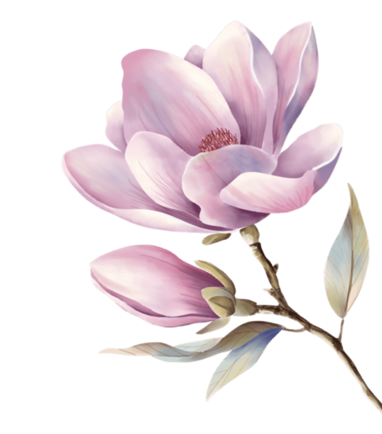
These colors were not designed on a screen — they were sampled from photographs of hand-crafted giant crepe paper peonies (60–80cm blooms) photographed in natural garden light. Because the hues already coexisted in one physical artwork, the palette is inherently harmonious.
這些顏色不是在螢幕上調出來的 — 它們取樣自手作巨型皺紋紙牡丹(花徑 60–80 公分)在庭園自然光下的實拍照片。因為這些色彩本來就共存於同一件實體作品,整組色票天生和諧。
Sampling Notes
Pixel sampling by region: bright peony petals gave Peony Rose, the second dusty bloom gave Dusty Rose and Petal Edge, the stamens gave the single warm gold, foliage shadow anchored the deep green, and the blue-gray dress in frame became the cool neutral.
分區像素取樣:亮粉牡丹花瓣 → 牡丹緋;灰粉花 → 乾燥玫瑰與瓣緣粉;花蕊 → 蕊心金;葉叢陰影 → 庭園深綠;入鏡的藍灰洋裝 → 霧藍灰。花瓣三階由內而外是現成的漸層層次。
Usage
60% warm paper white, 25% pinks, 10% garden green, 5% gold + mist blue. Stamen gold stays small — it is the stamen's proportion in the real flower. Never pure black text; use the deep ink derived from garden green.
用色比例 60% 紙白底、25% 粉色系、10% 庭園綠、5% 金+藍灰。蕊心金只做小面積 — 那是它在真花裡的比例。文字不用純黑,用庭園綠加深的墨綠黑。