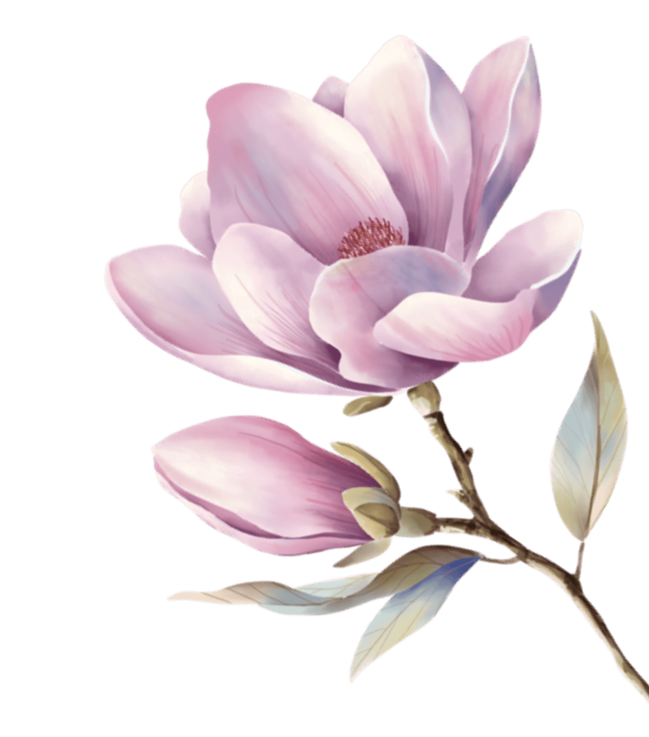
Inspired by alexfisherdesign.ca — a freelance illustrator portfolio evoking enchanted forests, storybook warmth, and nature-inspired whimsy. Colors are drawn from illustration titles: "In the Golden Afternoon", "Cotton Candy Chills", "Pine Trees", "Weeping Willow".
靈感來自加拿大插畫師 Alex Fisher 的作品集 — 每個色彩都從她的插畫主題萃取:金色午後的溫暖光影、棉花糖般的夢幻粉色、森林苔蘚的沈穩綠意、柳樹的柔和鼠尾草色。整體氛圍如同翻開一本精緻的繪本。
Color Philosophy
Every color tells a story from the woodland. Golden Afternoon is warm honey light filtering through forest canopies. Forest Moss anchors the palette with deep, quiet green — used for headings and CTAs. Cotton Candy adds whimsy without childishness. Parchment Cream replaces white — nothing in this system is cold or clinical.
每個色彩都來自林間故事。金色午後是穿透樹冠的蜂蜜暖光。森林苔蘚用沈靜的深綠錨定整個系統。棉花糖粉帶來奇幻感但不幼稚。羊皮紙奶油色取代純白 — 這個系統裡沒有冰冷的東西。
Typography
Playfair Display for headings — elegant serif with storybook gravitas. Nunito for body text — rounded, friendly sans-serif that reads like a warm conversation. The contrast creates "enchanted but approachable": serious enough for professional work, soft enough for dreamers.
標題用 Playfair Display 優雅襯線體,像繪本的章節標題。正文用 Nunito 圓潤無襯線體,讀起來像溫暖的對話。兩者的對比製造「魔法但親切」的效果。