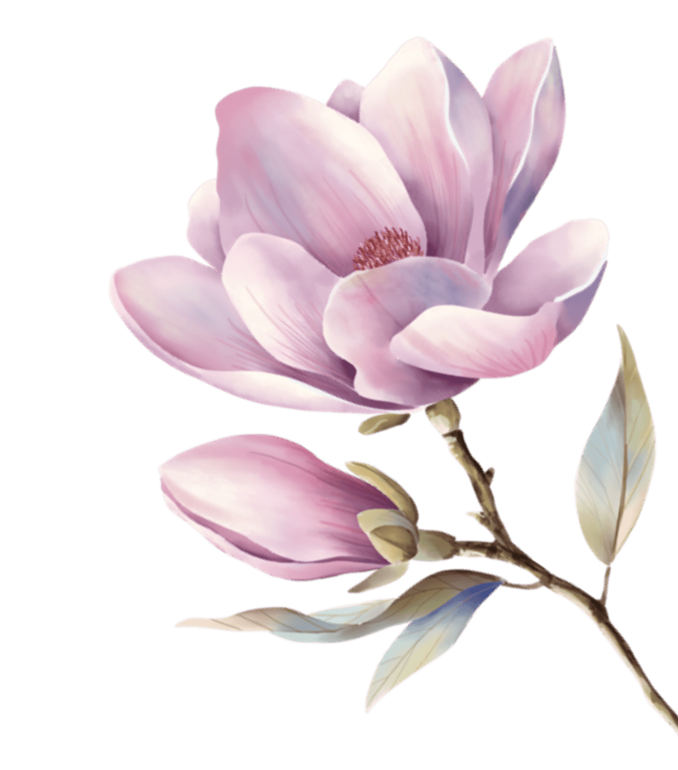
Inspired by Giorgio Morandi's muted still-life palette — colors that feel like morning light on linen.
這套設計系統的靈感來自莫蘭迪的靜物畫色調,所有顏色都帶著灰調的溫柔。薄荷系的冷、薰衣草的灰紫、奶油底的暖,加上金色裝飾線作為古典簽名。
Color Philosophy
Every color in this system is grey-mixed. No pure saturated tones. The palette creates a gallery-like calm that lets content breathe.
每個顏色都混入了灰調。沒有純飽和色。這個色盤創造了一種美術館般的靜謐,讓內容有呼吸的空間。
Typography
Playfair Display for headings (editorial gravitas), Lora for English body (calligraphic warmth), Noto Sans/Serif TC for Chinese (bilingual harmony). Gold drop caps as the editorial signature.
標題用 Playfair Display(編輯感),英文內文用 Lora(書法溫度),中文用 Noto Sans/Serif TC(雙語和諧)。金色首字母大寫作為編輯簽名。